Branding
For the project, we made an appropriate branding that is based on the SOLID logo. We did this by using several branding techniques commonly used to create a brand from scratch.
1. Personifying the product
To differentiate our brand from Solid, we tried personifying our product by asking some thought-provoking questions:
- If our product was a person, what would they wear to a party, how would they act at the party and what would be their favorite music?
- If we had to associate our product with a season, which would it be?
2. Term association
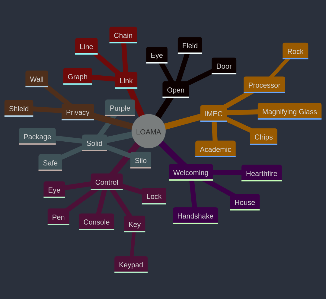
In order to find out which things or terms we associated with our product, we created a mindmap with terms that are related to our project and objects we associate with those terms.

This gave us more insight into what we could use as a basis for naming our product.
3. Name
The name LOAMA is an acrynom:
Linked Open Access Management App
It's a technical way to describe our project, but the acronym (Loama) was an unexpected inspiration for our project's identity, as it became a basis for which we build our brand, crest and color palette.
4. Typography & Color Usage
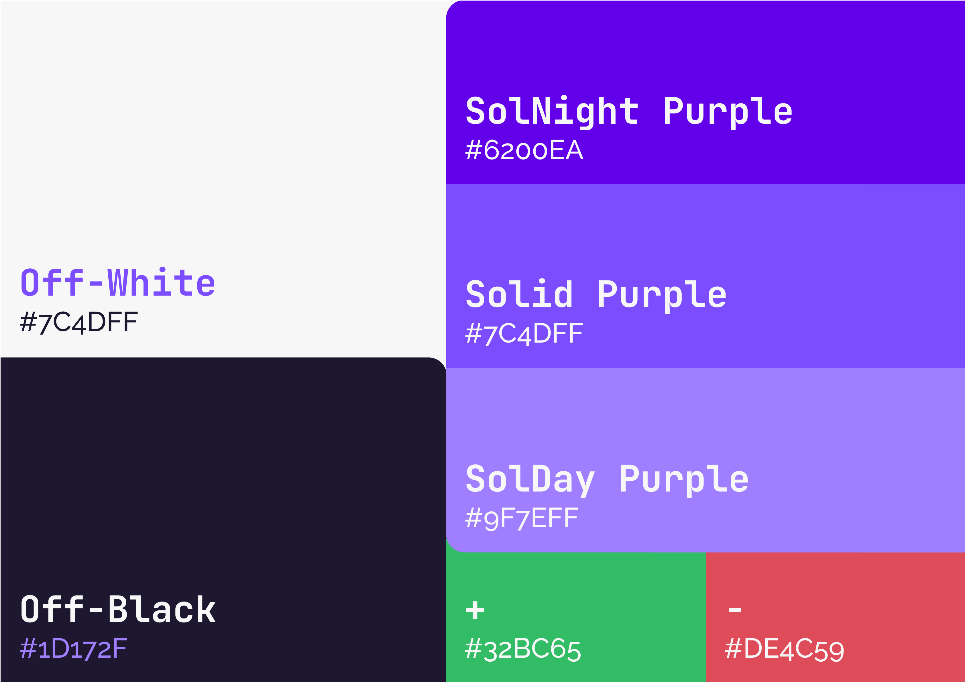
During the design process, we researched and defined a typography & color palette in order to have a consistent look & feel through the project. These elements were re-used within the design prototype, presentations, live demos and documentation.

For our font, we've decided to use a monospace font (Jetbrains Mono) for headers, wordmark or highlighted text. This allows us to emit a technological feeling and worked great in creating a contrast with our sans-serif font.
Our standard / sans-serif font of choice is the Raleyway font, as it already has a usage: It's the main font style of the Solid project. Because of this, our project has a strong correlation to Solid, but can differentiate itself by using the mono font.